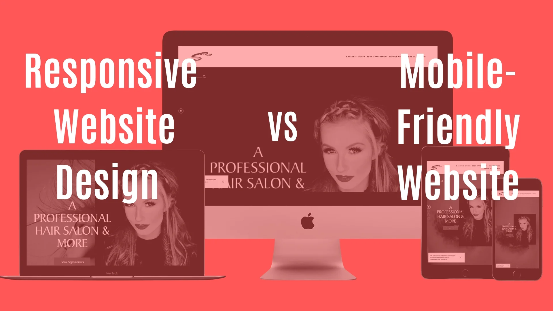
Responsive Website VS Mobile Friendly Website ?
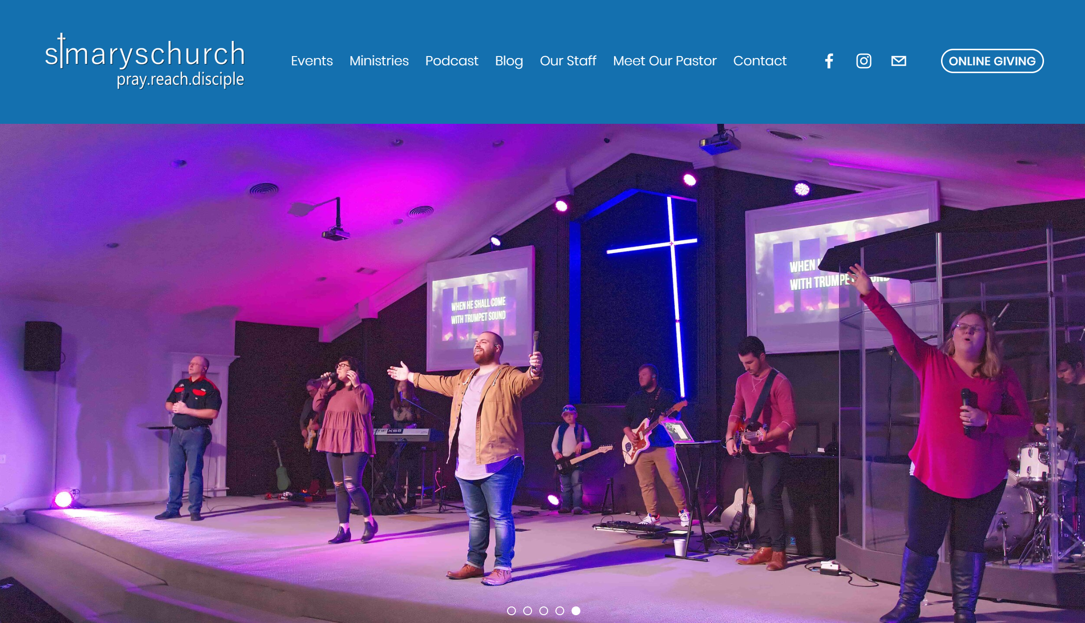
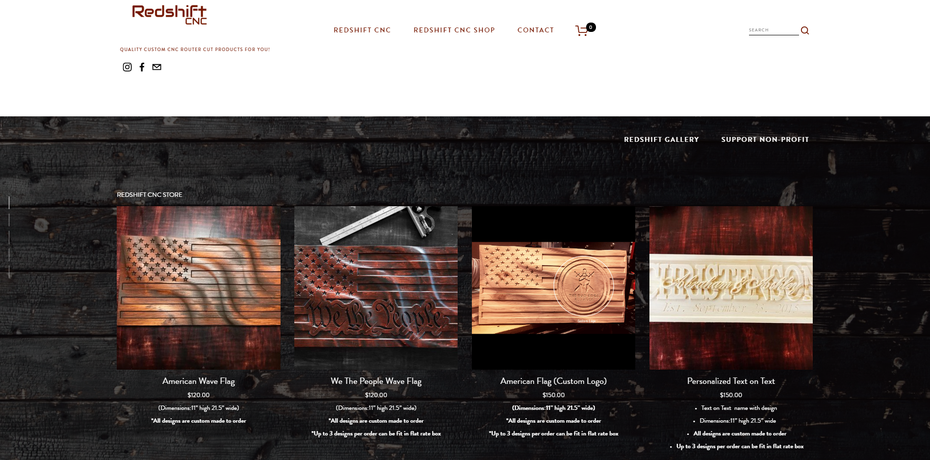
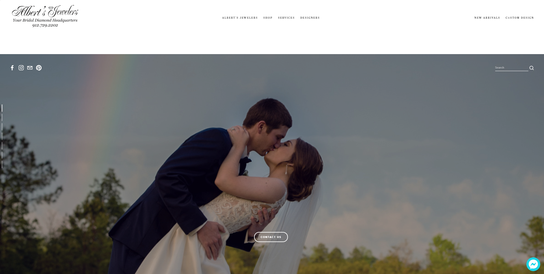
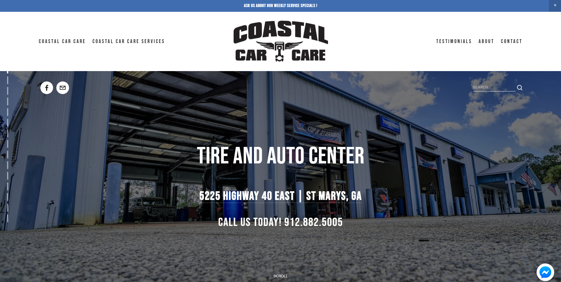
A few weeks ago I was in a meeting with a client regarding updating his current small business website. I proceeded to ask a few questions about his business. He, in turn, responded with clear and succinct answers. He then continued share with me his future business goals while I looked at his website. My first impression is his website is a bit outdated but still very usable on a desktop computer. I then picked up my phone and navigated to his website; and there lied the first major issue. The website resized to display on my phone’s screen, but the navigation menu was painfully difficult to use on a phone. Small business websites is quite often the very first impression that most consumers will have of your business, and like the old adage states "you only get one chance to make a first impression.” And in today’s ever increasingly competitive markets a poorly designed website or even worse a non-responsive website can easily become a deal breaker for most consumers.
“83% of mobile users say that a seamless experience across all devices is very important.”
“Mobile traffic as a share of total global online traffic in 2018 is 48.2%”
Mobile First Indexing
On March 26, 2018, Google announced that going forward they are prioritizing mobile-friendly versions of websites for indexing and ranking. If you are unsure if your website is mobile-friendly head over to this link and find out. Now there are differences between a mobile-friendly website and a responsive website. A Responsive web design: Serves the same HTML code on the same URL regardless of the users' device (desktop, tablet, mobile, non-visual browser), but can render the display differently (i.e., “respond”) based on the screen size. So in plain English, a responsive website will change its layout according to the device that you are using. A mobile-friendly website may still require some pinching and zooming and accompanied with lots of frustration. Bad user experience on a website is akin to going to a bad restaurant. The very next restaurant that you go to is immediately compared to your last experience. 83% of mobile users say that a seamless experience across all devices is very important. (Wolfgang Jaegel)
“Only 17% of small businesses who have a website have a site that’s mobile friendly”
Imagine your driving home from a dinner date with your wife, suddenly your car slowly comes to stop on a busy freeway. You reached for your phone to call a local repair shop but you don’t have their number saved in your contacts. You then decide to head over to their website but quickly remember your last experience on that website was very frustrating and instead opted to head to a competitor website instead. Now imagine how many times scenarios like this play out within a year. Having mobile-friendly website is the good first step but ultimately having a mobile responsive website is the new standard.
“ As indicated by Google, 61% of clients are probably not returning to a mobile site if they experienced difficulty accessing it and 40% visit a competitor website instead. ”
Solutions
The good news is that it’s never to late to upgrade a website. Some may require a bit more work that others but by no means should it be ignored.
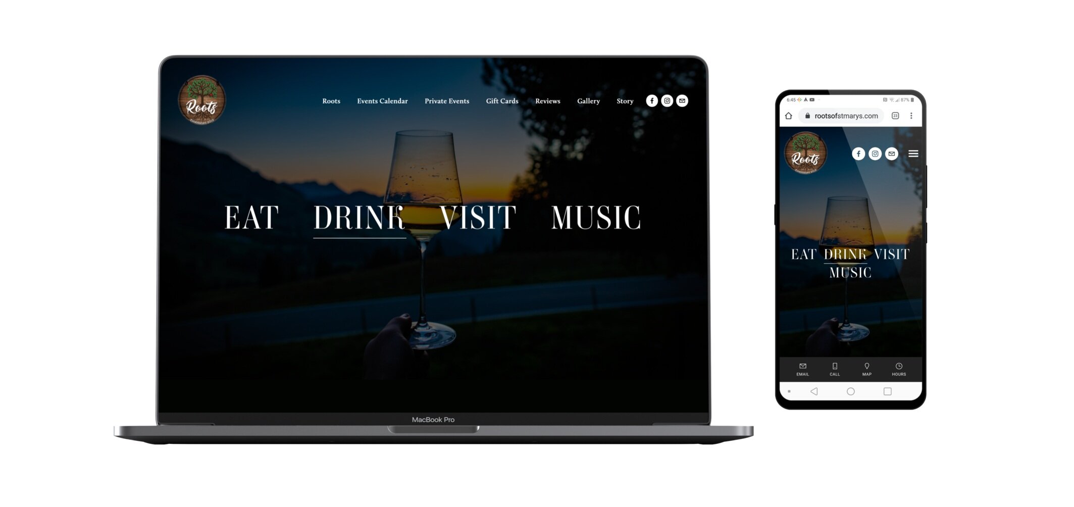
My Services
HMC is very different from your typical website design service. I am self-taught, and I have over 10 years of experience in three specific areas (photography, videography, social media marketing). My expertise in these three areas enables me to design a website that grows with your small business or organization.
Mention "Kick Start My Small Business" for a 15% Discount !!! Offer Code (KSYBT4)
Photography & Videography Services included w/website design *
Flexible Payments Plans
Search Engine Optimization
Google Suite Email Integration
Custom Domain
E-Commerce